
Dentsu
Designing data-driven experiences for a global marketing platform
Overview
dentsu operates a global client portal used by internal teams and clients to manage marketing activity across multiple markets and media channels.
The platform surfaces large volumes of operational and financial data, helping teams understand campaign performance, project activity, and budget allocation.
My role focused on improving how this information was structured and presented within the platform, making complex data easier to understand while contributing improvements back into the design system.
My contribution
Design systems
UX strategy
Interface design
The team
Company headcount 68,000
Product designers 15+
UX researchers 4
Product managers 10+
Developers 50+
Year
2025 – 2026Clients using the platform


The challenge
The client portal aggregated data from multiple marketing systems and media platforms. While the platform contained valuable information, the way it was presented often made it difficult for users to quickly understand what was happening across their projects.
Key challenges included:
- Large amounts of complex operational data
- Interfaces that felt dense and difficult to scan
- Important insights buried within deeper navigation layers
- Inconsistent UI patterns emerging as the platform evolved
The goal was to redesign key areas of the platform so users could quickly understand activity, budgets, and project status without needing to navigate through multiple layers of information.
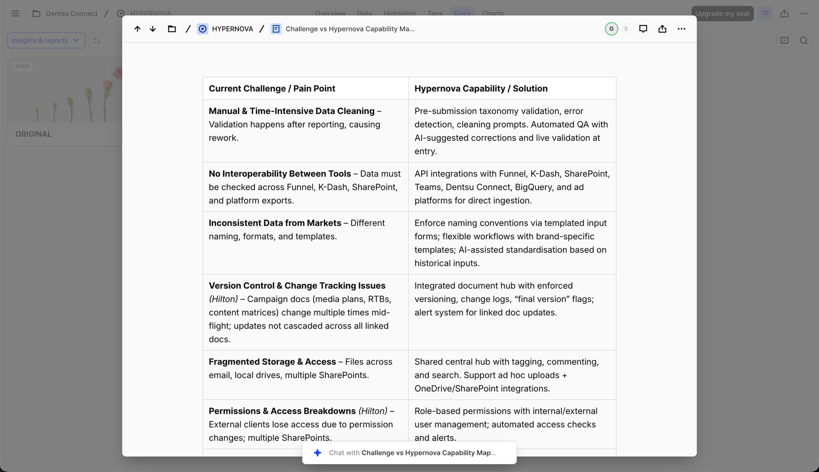
Capability mapping helped translate complex operational challenges into clear product opportunities by aligning user pain points with platform capabilities and identifying where automation and AI could provide the most value.
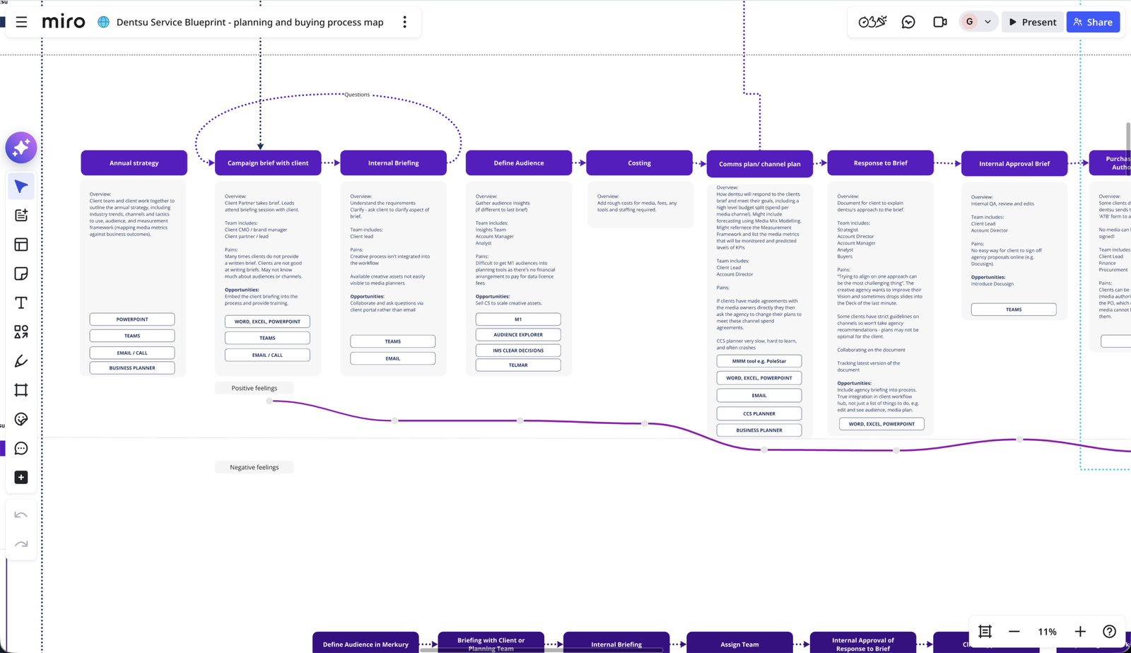
I mapped the end-to-end media planning and buying process to understand how teams moved from strategy through to campaign execution. This service blueprint helped identify workflow inefficiencies, tool fragmentation and communication gaps between internal teams and clients. By visualising the entire process, we were able to pinpoint opportunities where the platform could streamline collaboration, standardise workflows and introduce automation.
Approach
Creating a clearer homepage experience
Rather than treating each feature as an isolated design task, I approached the work through the lens of system thinking.
Each interface was designed with the goal of identifying reusable patterns that could strengthen the wider design system.
This ensured new features could scale beyond the immediate product they were built for. One of the key areas of focus was redesigning the client portal homepage.
The goal was to transform it from a static landing page into a dynamic overview that surfaced meaningful information at a glance.
I introduced a system of digestible information slices, each designed to highlight key activity within the platform while encouraging deeper exploration.
Examples included:
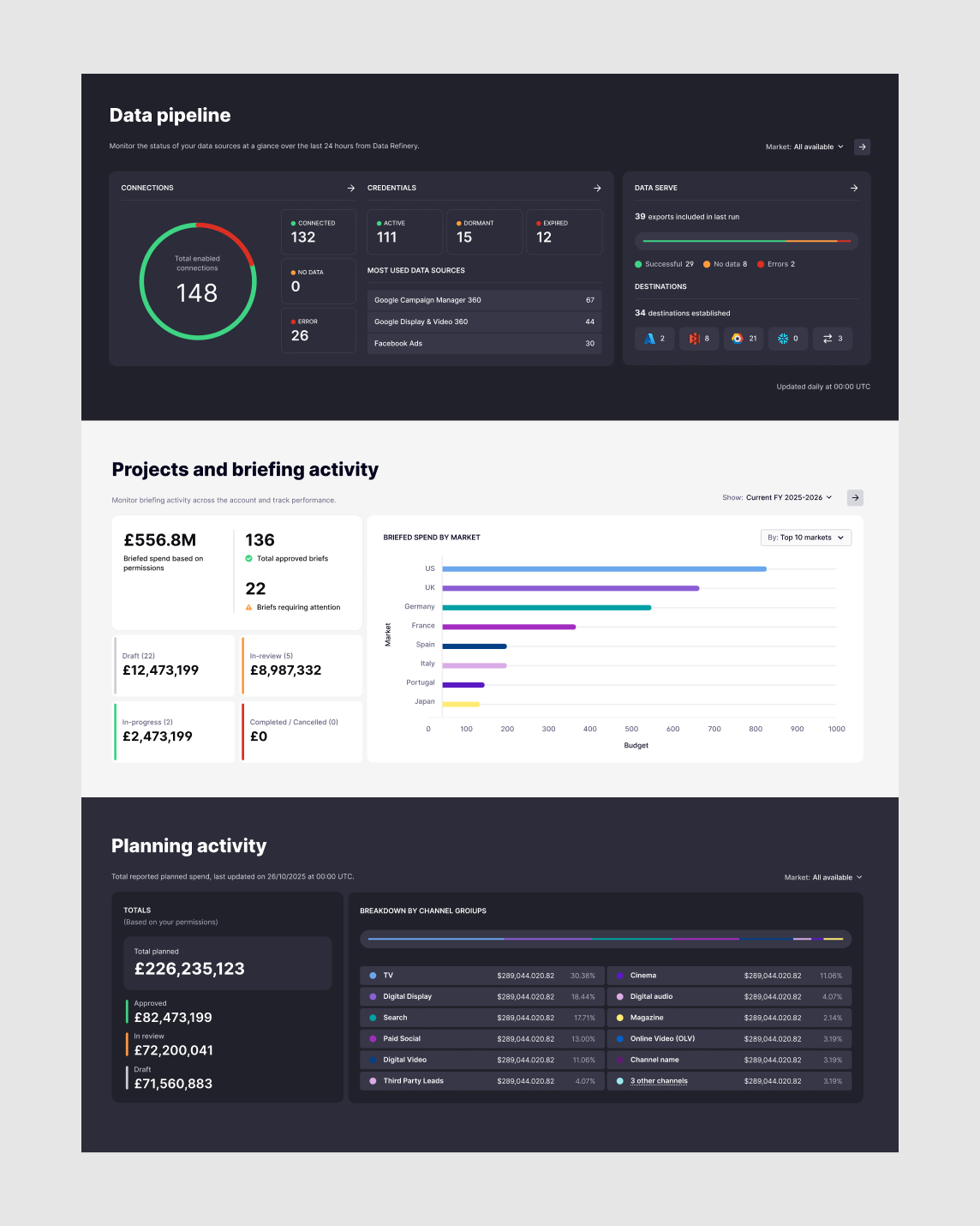
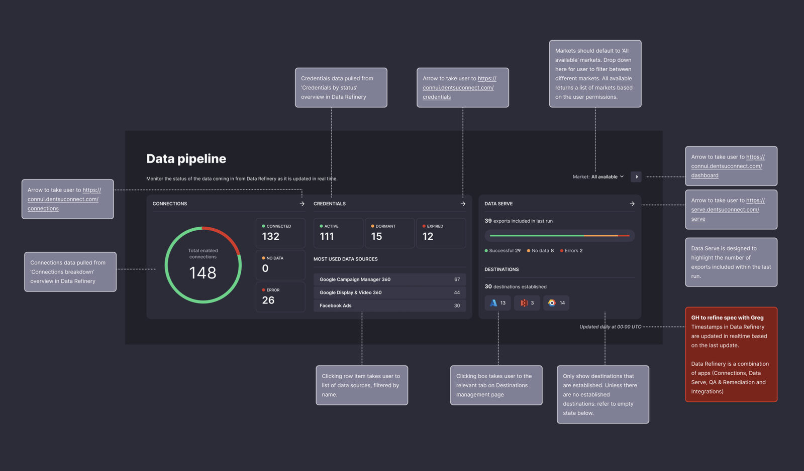
- Data pipeline overview showing the status of data connections and integrations monitoring activity across different media channels
- Project activity insights highlighting market activity, project progress, and current statuses
- Planning activity summaries displaying budget allocations and real spend across media channels
This approach allowed users to quickly understand platform activity before deciding where to explore further.
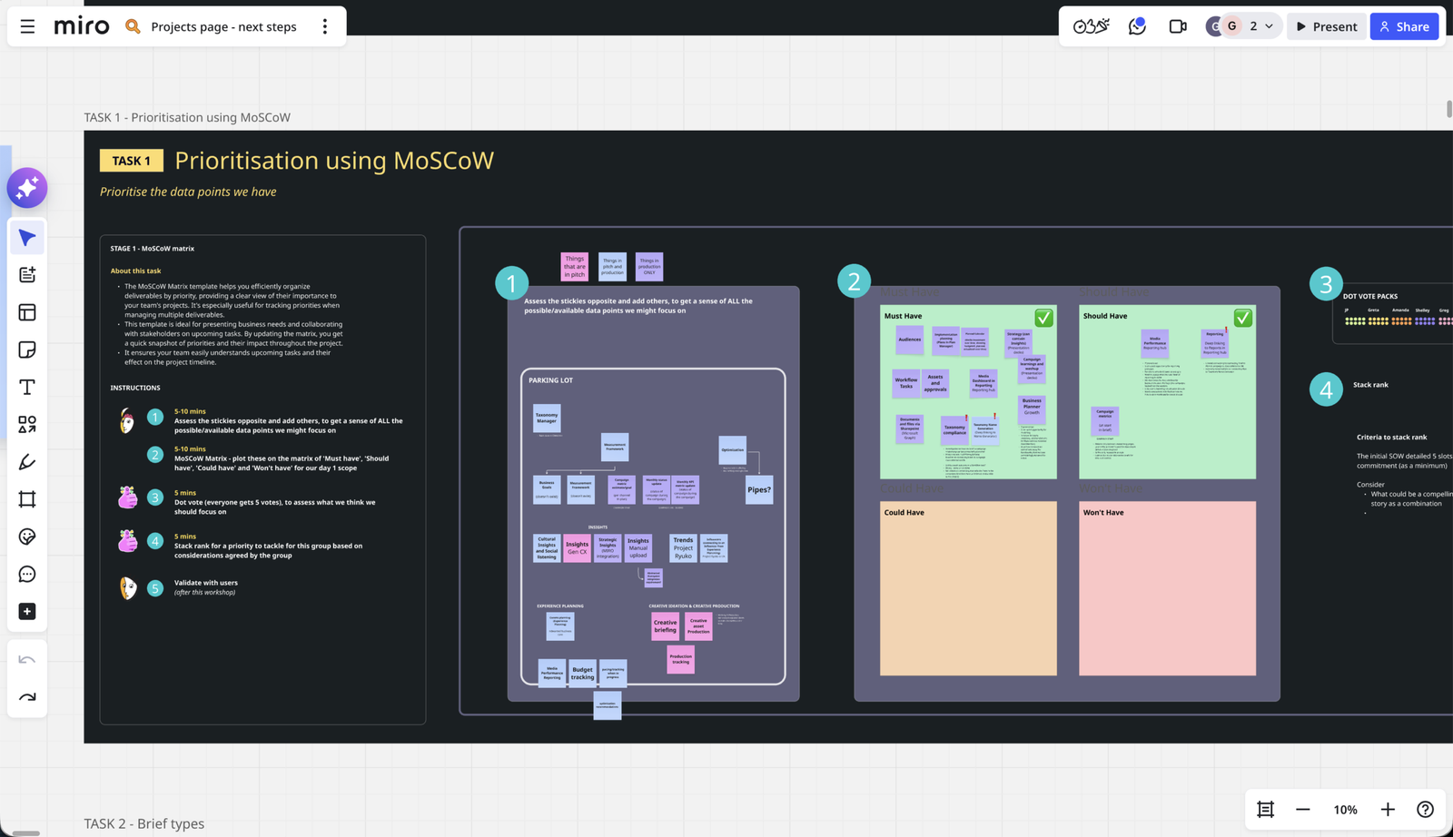
I facilitated a prioritisation workshop using the MoSCoW framework to identify which data signals were most valuable for users. By mapping and ranking potential insights with stakeholders, we were able to align on the information that should be surfaced on the homepage. This exercise directly informed the modular dashboard components, ensuring each “information slice” delivered meaningful value at a glance.
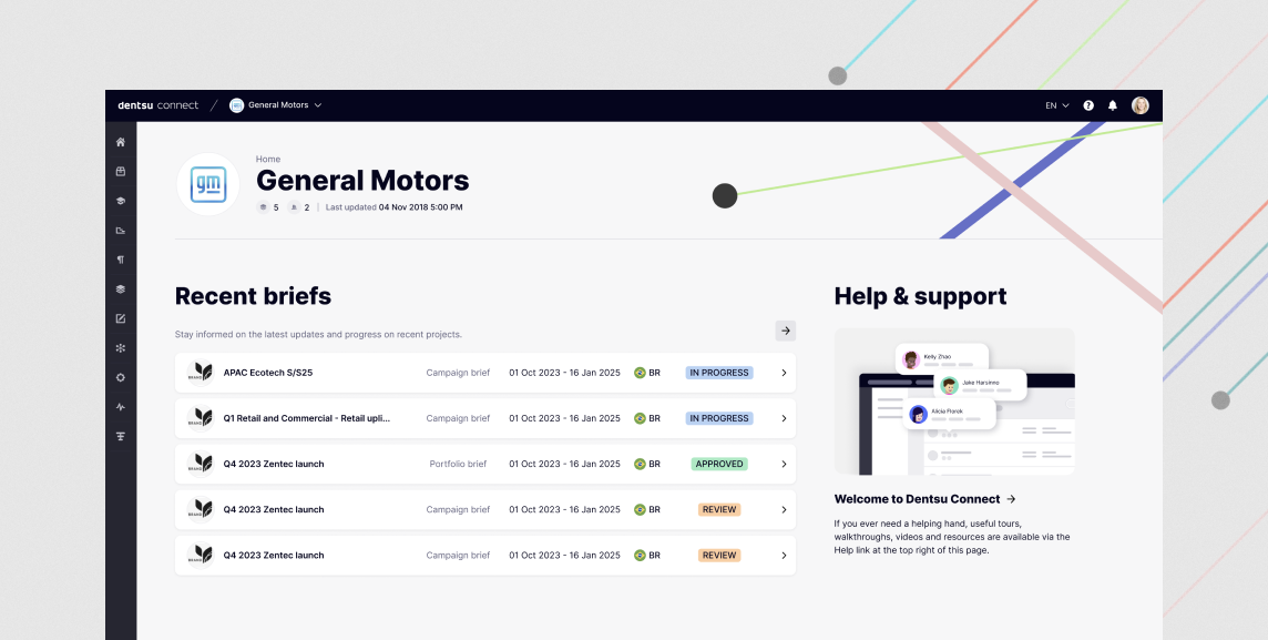
The client portal homepage was redesigned to surface the most relevant information first, including recent briefs, project statuses and support resources, allowing users to quickly orient themselves and continue their work.
I introduced a system of modular homepage slices that pull live data from native applications within the platform. These components surface critical insights such as project activity, campaign status and workflow updates, enabling users to quickly understand what requires their attention before navigating deeper into the product.
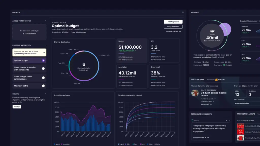
Redesigning the projects dashboard
Projects within the platform often contained large volumes of information, including campaign data, financial metrics, timelines, and operational updates. For many users, understanding the current status of a project required navigating through multiple pages and datasets.
To simplify this experience, I redesigned the projects dashboard to surface key information in a more structured and digestible format.
The solution used a modular bento-style layout, where different cards displayed the most relevant live information from a project in a single view. Each module focused on a specific type of insight, such as project status, activity updates, budget information, or key metrics.
This approach helped break complex information into smaller, more readable sections while allowing users to quickly scan the state of a project without needing to navigate deeper into the platform.
The modular structure also allowed the dashboard to scale easily as new data sources or project insights were introduced.
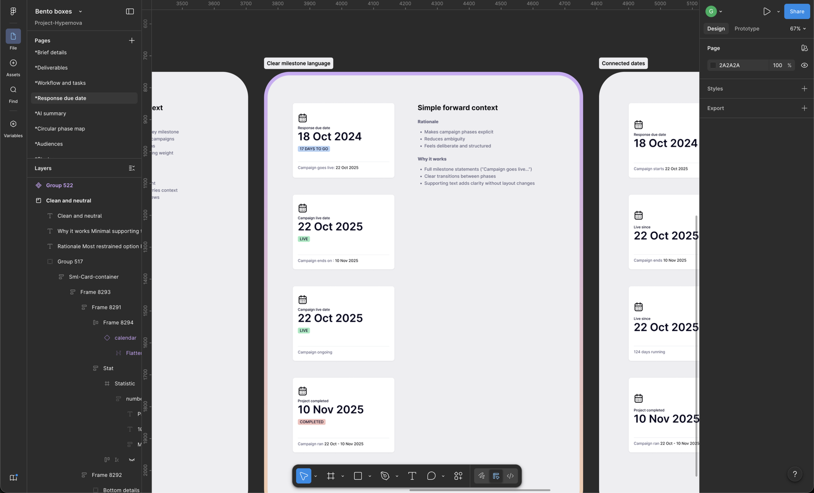
Each bento box was iterated on several times to achieve the right visual hierarchy and ensure the components worked cohesively without competing for attention.
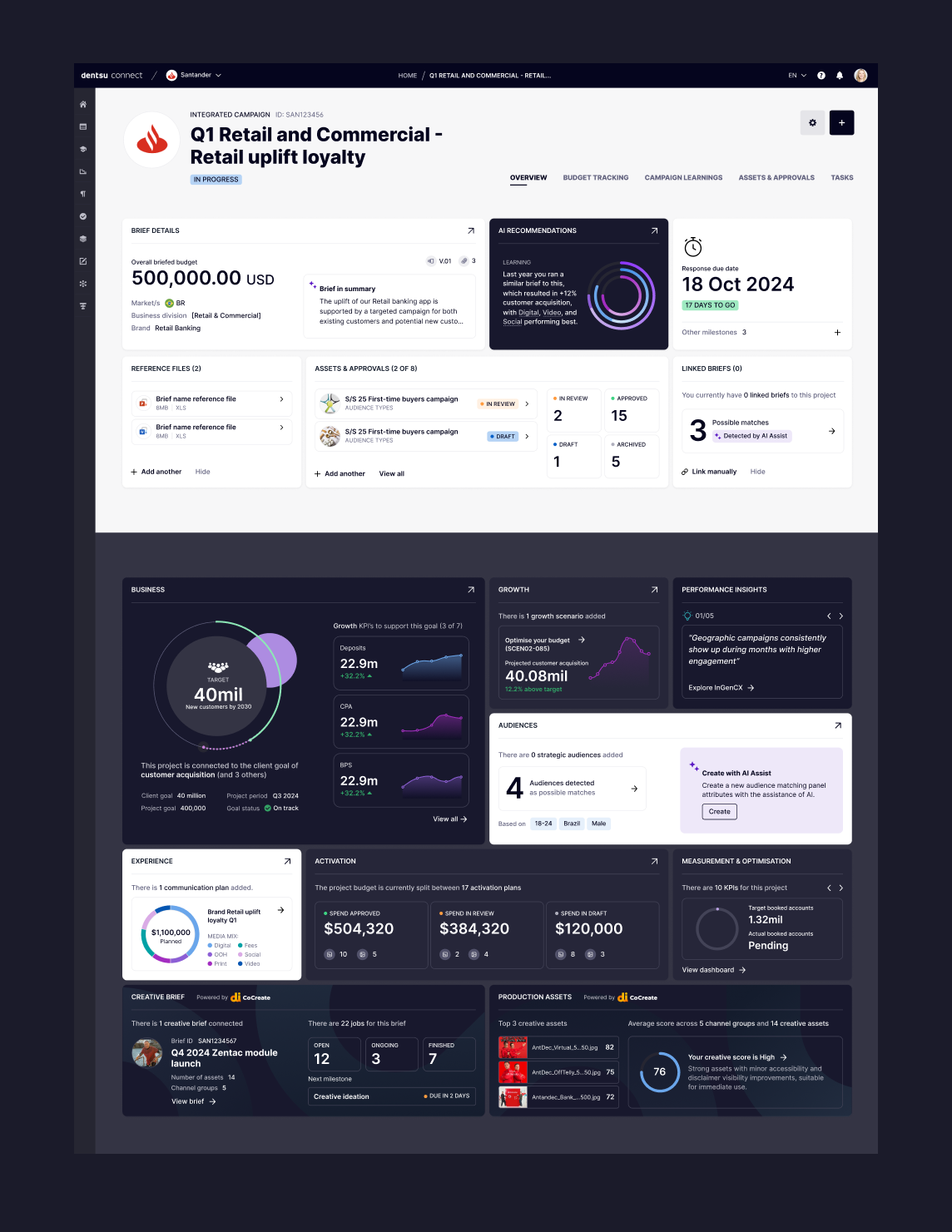
The dashboard was designed as a modular information architecture that consolidates performance metrics, audience insights and AI-assisted recommendations into a single, coherent interface. Each module serves as a focused entry point into a distinct area of platform activity, surfacing complex datasets in a way that is both scannable and actionable. By structuring the interface around discrete information components, users can quickly build an understanding of campaign performance, audience engagement and operational activity without navigating through multiple applications. AI-generated insights are embedded alongside core metrics to highlight emerging patterns, surface opportunities and guide user attention toward areas that may require further exploration.
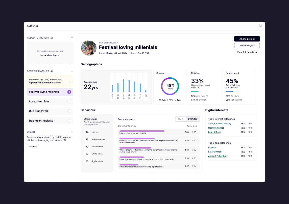
The AI-assisted audience discovery tool helps planners identify relevant audience segments by analysing available panel data and campaign inputs. The interface surfaces potential audience matches and provides contextual insights, including demographic breakdowns, behavioural patterns and digital interests. This allows teams to quickly evaluate whether a suggested audience aligns with campaign objectives, reducing the time spent manually researching audience profiles and enabling more confident planning decisions.
Improving product navigation
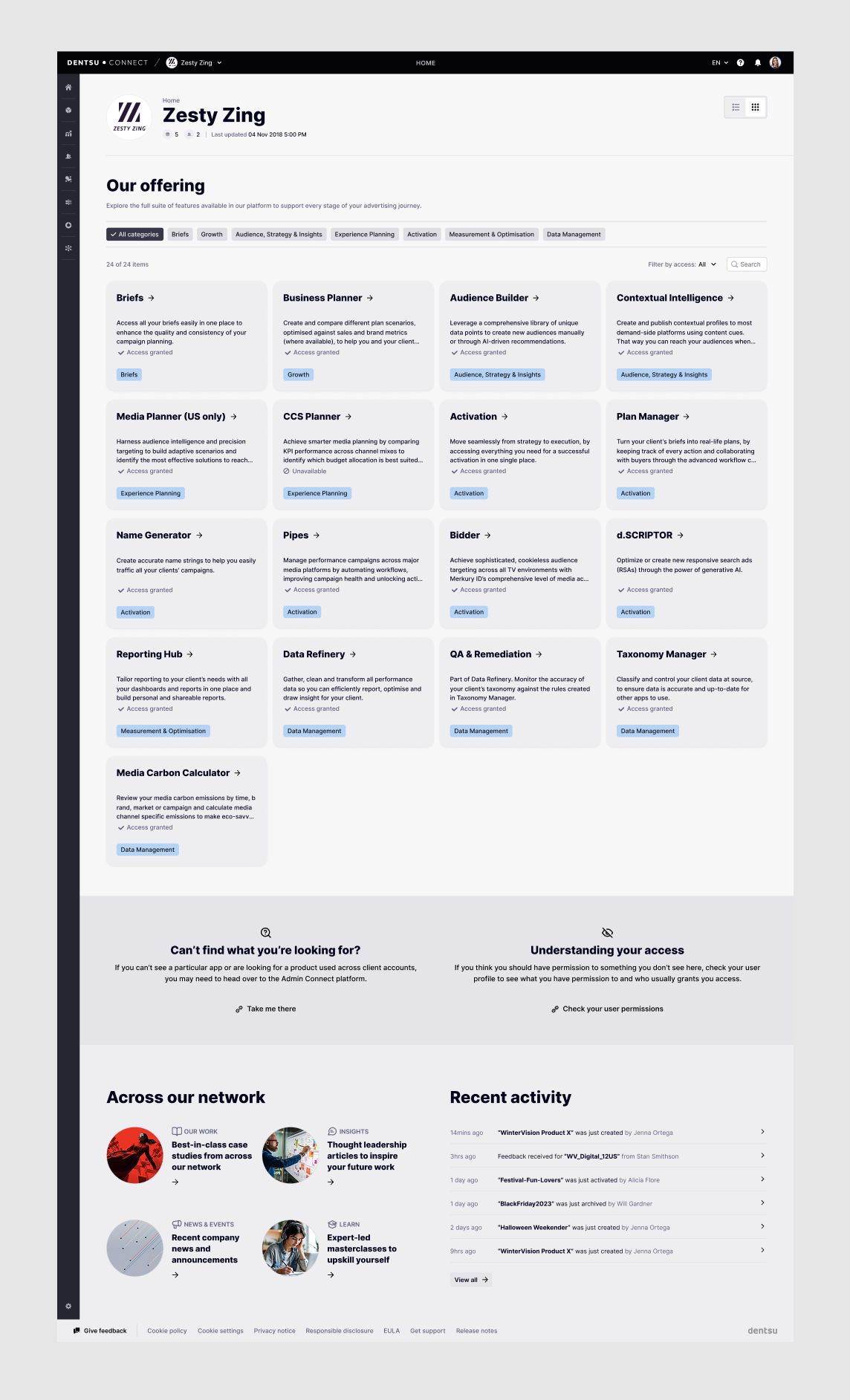
To make the platform easier to navigate, I introduced an index card view of the platform’s applications.
This provided a clearer overview of available tools within the ecosystem while allowing the layout to adapt based on user permissions.
Different roles could see different sets of tools, ensuring the interface remained relevant and uncluttered.
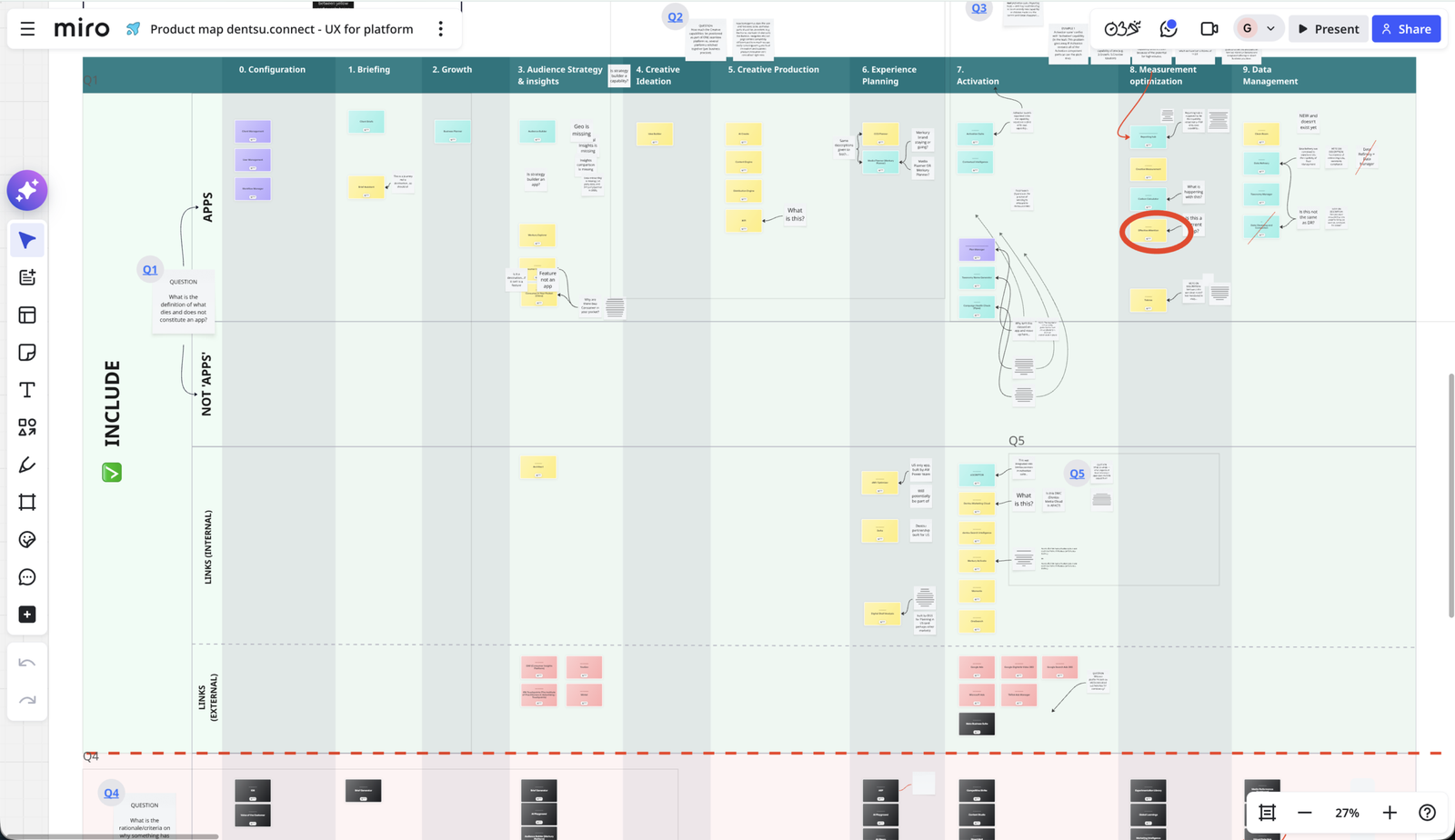
Before designing the app directory, I created a product map to understand how the platform’s tools supported each stage of the campaign lifecycle. Mapping the ecosystem helped identify how individual applications related to one another and where they fit within the wider workflow. This informed the structure of the card-based interface, allowing users to browse apps in a way that reflects how work actually happens across the platform.
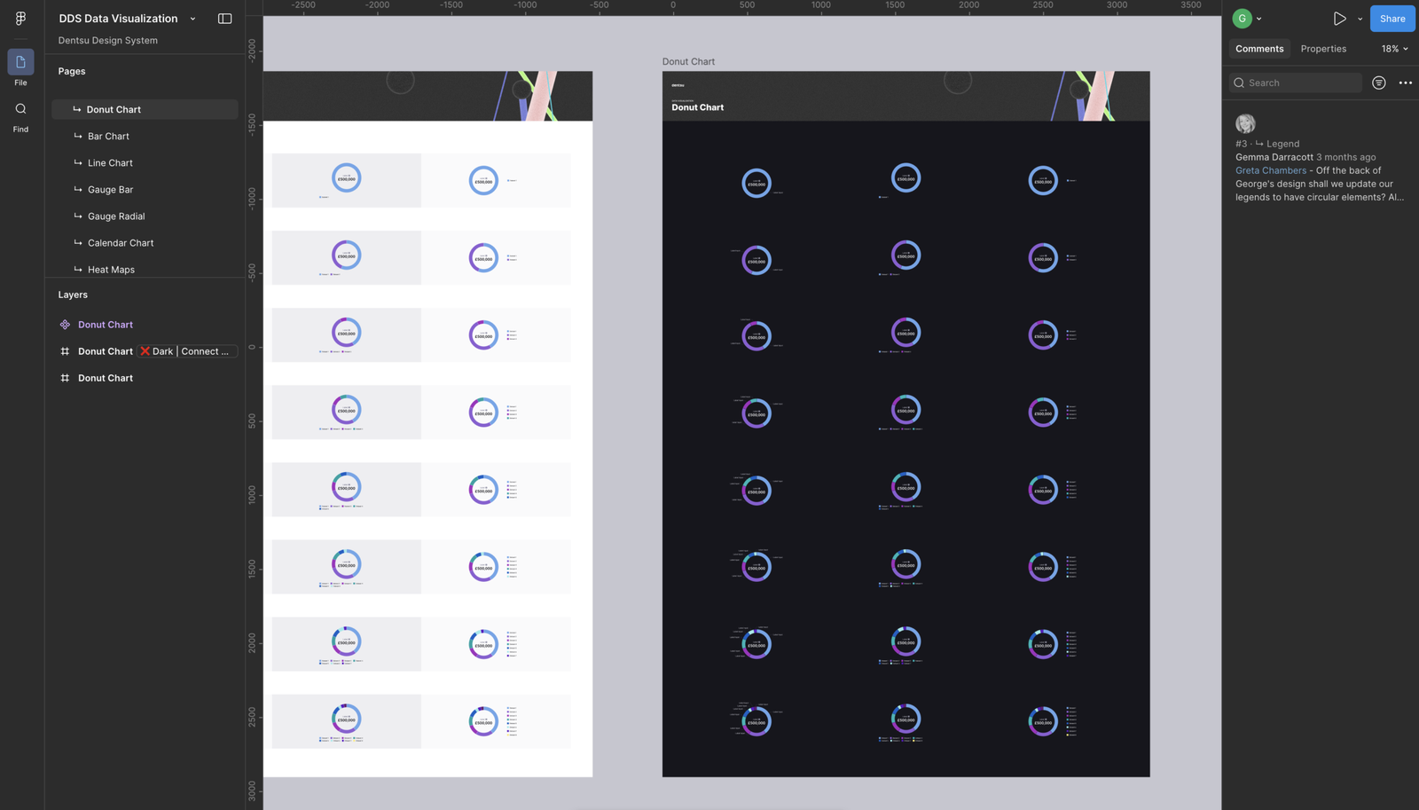
Contributing to the design system
While delivering product features, I also contributed improvements back into the platform’s existing design system.
New components and interaction patterns developed during projects were documented and shared to ensure they could be reused across the wider product ecosystem.
This helped maintain visual consistency while allowing the design system to evolve alongside the product.
Collaboration and delivery
The work involved close collaboration across product, engineering, and design teams.
Alongside designing new features, I:
- supported other designers during high-pressure delivery periods
- worked closely with developers to improve design-to-engineering handoff
- participated in sprint-based delivery cycles
- carried out design QA to ensure designs were implemented consistently
- contributed to strategic discussions with senior internal stakeholders
This ensured design quality remained high throughout the development process.
The outcome
The work helped transform key areas of the platform into clearer, more structured experiences that made complex information easier to understand.
By surfacing insights at a glance and structuring dashboards around meaningful activity, users could quickly understand what was happening across their projects and campaigns.
The work also contributed improvements back into the design system, supporting a more consistent and scalable approach to product development across the organisation.